10 years ago, I started teaching classes at 1871.
Several times each year, I’d take the train to the Mart, ride the elevator up and speak to a group of startups about content marketing and web design. These days, it’s all online, but still going strong.
I’ve given dozens of presentations to hundreds of Chicago startups, discussing content strategies and reviewing websites. And I’ve noticed some patterns, some common issues and some big opportunities.
These are my most common recommendations for startup websites.
Acting on these shouldn’t be expensive or time consuming. My hope is that they can all be handled through your content management system at no cost and in an afternoon:
1. Homepage Header: Make it immediately obvious what you do
Assume your visitors don’t know you yet. They came in cold and their first question is “Where am I?” and “What does this business do?”
Your homepage header needs to answer that question. It is the 6-10 word version of your elevator pitch. It’s the text within the <h1> tag right there at the top.
Often, it’s just the name of the business category, but for startups, this can be tricky. You might be an innovator. Maybe you don’t fit nicely into a category. Or you may be creating a new category. That’s great, but you still need to let your visitor know what you do at a glance.
Be specific. Use terms that 100% of your visitors understand.

Writing the homepage header is often a big challenge. It raises questions about positioning, differentiation and target keyphrases. Keeping it simple is harder than it looks.
As a rule, it’s better to be clear than clever.
2. Pictures of Faces: Make it personal
Startups have a big advantage over large companies, they can easily make a personal connection by showing the people, purpose and story.
But many startup websites fail to take advantage, even though it’s easy.
- Show faces up front
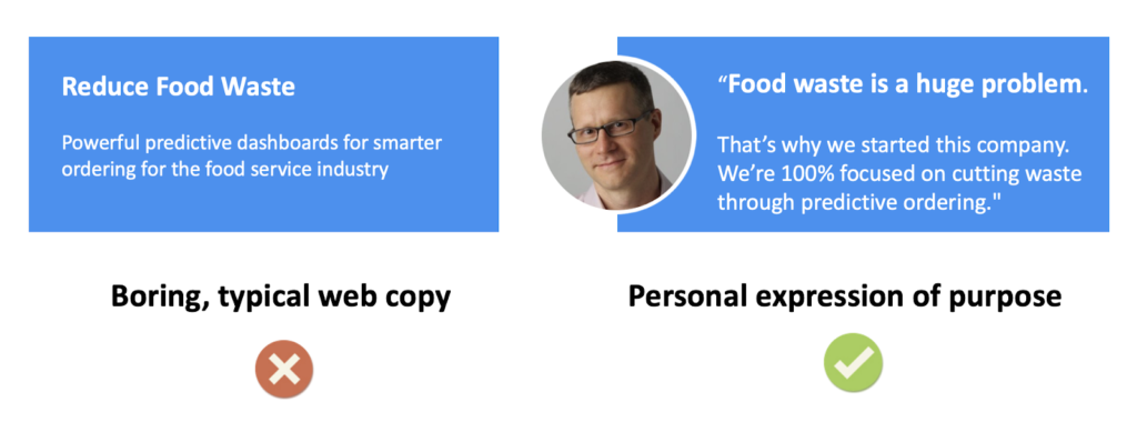
- State your purpose. Put quotes around it.
- Tell a personal story on the about page
The impact of these basic elements is huge. Now they may feel something. Now they may care. Now they can align with your purpose. Now they may remember your story.

Feel the difference? The face and the quotes make it personal. You’re a person on a personal mission. You are speaking to your visitor through the website. It transforms brochure copy into a first-person pitch.
Faceless websites don’t create that kind of connection.
3. Calls to Action: Make the next steps clear and compelling
Now they know where they are, who you are, and why you exist. Your purpose and offer is clear. Your visitor has enough information to make a decision about next steps.
Sometimes the decision is obvious. “This isn’t for me” …and they hit the back button. Or “I definitely need this” …and they take the next step and click over to the contact or sign up page.
But often the visitor isn’t sure. They’re on the fence. They’re thinking about taking action, but they still have a few doubts. They’re wondering if this is a waste of time.
In these cases, the call to action (known as the “CTA” to marketers) can make the difference.
No one clicks on a call to action (or anything else on the internet) until they have done a split second cost-benefit calculation. If the benefits exceed the cost, they click.
So you can increase the clickthrough rate of a call to action by making the perceived benefit bigger or the perceived cost lower. Either way, it comes down to those few words in the button or link.

This is the money click, so work hard on it. Look closely at the verbs. Are they specific? Compelling? Do they work with the psychology of the visitor?
The job of this button is to guide them forward. It should maximize the “conversion rate” which is the percentage of visitors who act. Even a small improvement can mean a dramatic difference in demand over time.
About Andy
Andy’s the co-founder of Orbit Media, an award-winning 40-person web design and optimization company here in Chicago. Over the past 20 years, Andy has provided digital marketing advice to 1000+ businesses and written 500+ articles on content strategy, SEO, visitor psychology and Analytics.
Join as an 1871 Early Stage Member.
Attend info sessionSubscribe to our ICYMI newsletter.
Share this post:

